

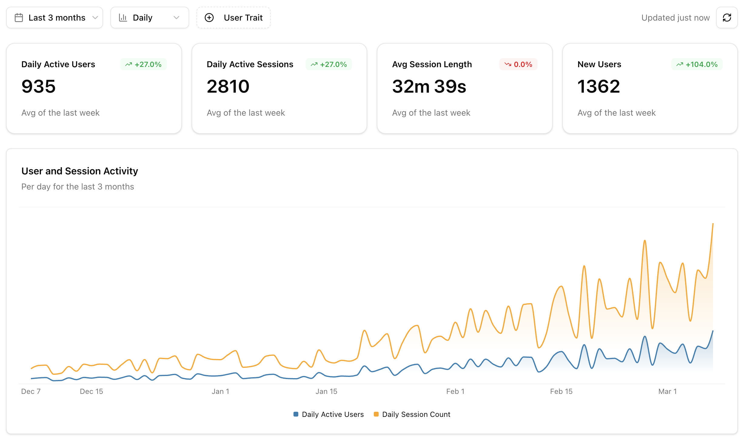
KPI Cards
The top of the dashboard shows four key metrics, each with a trend comparison to the previous period:Activity Chart
An overlaid area chart showing users and sessions over time. Use this to spot adoption trends, weekly patterns, and the impact of releases or announcements on usage.Users by Client
A donut chart showing how your users are distributed across AI clients — Claude Desktop, Cursor, Windsurf, and others. This helps you understand which clients to prioritize when testing and optimizing your tools.Most Used Tools
A horizontal bar chart ranking your top 7 tools by call volume. Each bar is split into success and error segments, so you can immediately see which tools are failing most often.Tool Latency
A line chart showing tool response time percentiles (p50, p95, p99) over time. Use this to catch performance regressions early and understand the latency experience for your typical and worst-case users.Agent Goals
If your project has enough data for Agent Goals, the dashboard includes two additional charts:- Goal Distribution: A donut chart showing the top 10 user intents across all sessions
- Goal Success Rate: A stacked bar chart showing how often each goal is accomplished vs failed, with color-coded progress bars