> ## Documentation Index
> Fetch the complete documentation index at: https://docs.agentcat.com/llms.txt
> Use this file to discover all available pages before exploring further.
# Dashboard
> See real-time usage and analytics for your MCP server.
When you have dozens of users and hundreds of tool calls flowing through your MCP server, you need a way to see the big picture. AgentCat's Dashboard gives you real-time KPIs, usage trends, and tool-level analytics so you can understand adoption and performance at a glance.
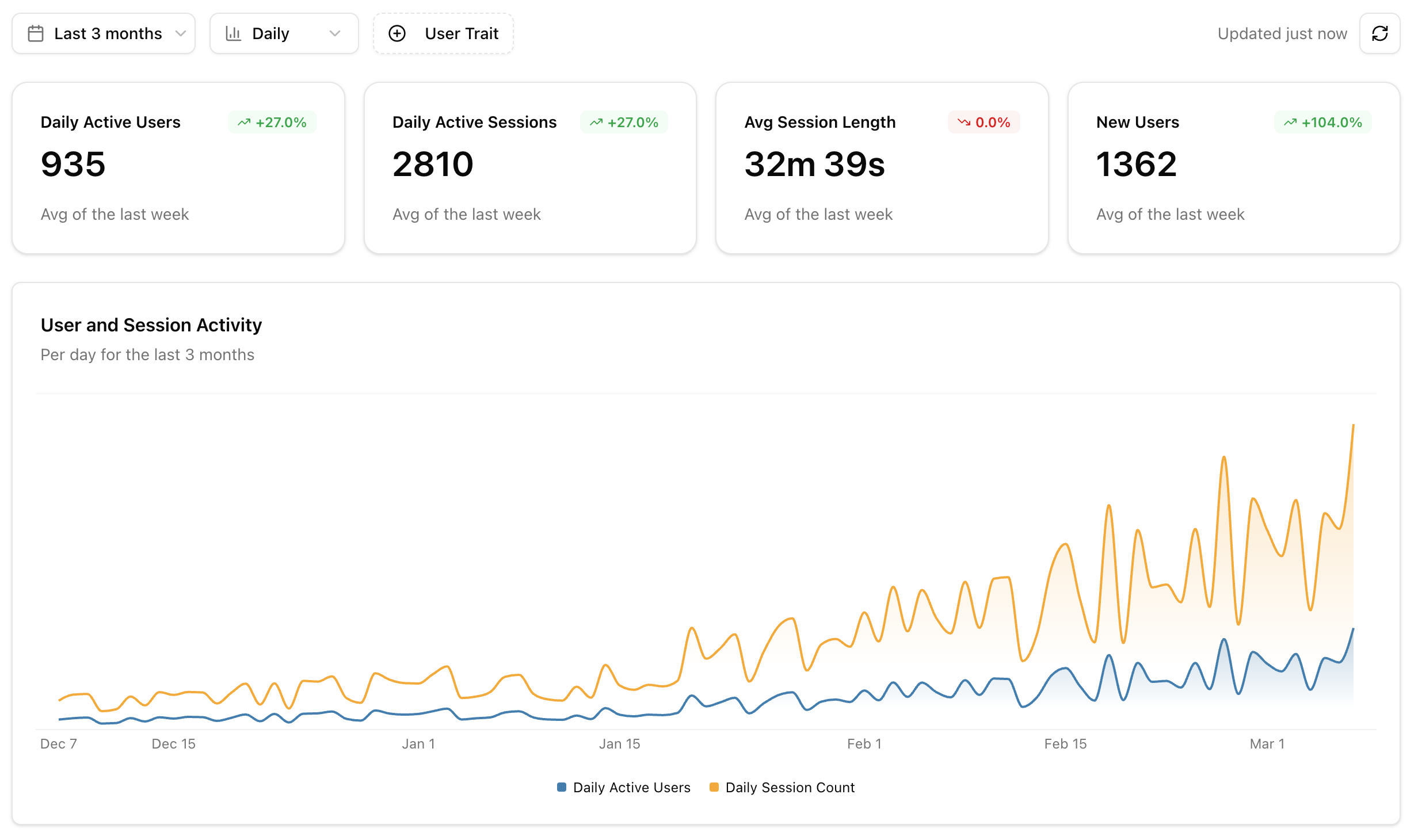 ## KPI Cards
The top of the dashboard shows four key metrics, each with a trend comparison to the previous period:
| Metric | Description |
| ---------------------- | ---------------------------------------------------- |
| **Active Users** | Unique identified users with at least one session |
| **Active Sessions** | Total sessions with at least one event |
| **Avg Session Length** | Mean duration across all active sessions |
| **New Users** | Users seen for the first time in the selected period |
## Activity Chart
An overlaid area chart showing **users** and **sessions** over time. Use this to spot adoption trends, weekly patterns, and the impact of releases or announcements on usage.
## Users by Client
A donut chart showing how your users are distributed across AI clients — Claude Desktop, Cursor, Windsurf, and others. This helps you understand which clients to prioritize when testing and optimizing your tools.
## Most Used Tools
A horizontal bar chart ranking your top 7 tools by call volume. Each bar is split into **success** and **error** segments, so you can immediately see which tools are failing most often.
## Tool Latency
A line chart showing tool response time percentiles (**p50**, **p95**, **p99**) over time. Use this to catch performance regressions early and understand the latency experience for your typical and worst-case users.
## Agent Goals
If your project has enough data for [Agent Goals](/features/goals), the dashboard includes two additional charts:
* **Goal Distribution**: A donut chart showing the top 10 user intents across all sessions
* **Goal Success Rate**: A stacked bar chart showing how often each goal is accomplished vs failed, with color-coded progress bars
## Recent Sessions
A widget showing the 5 most recent sessions with activity. Each entry shows the user, timestamp, and session activity level. Click any session to jump directly into [Session Replay](/features/session-replay).
## Filter Controls
Use the controls at the top of the dashboard to narrow your view:
| Filter | Options |
| ----------------------- | ------------------------------------------------------- |
| **Date Range** | Last 7 days, last month, last 3 months |
| **Granularity** | Daily, weekly |
| **Actor Trait Filters** | Filter by user properties set via the identify callback |
## KPI Cards
The top of the dashboard shows four key metrics, each with a trend comparison to the previous period:
| Metric | Description |
| ---------------------- | ---------------------------------------------------- |
| **Active Users** | Unique identified users with at least one session |
| **Active Sessions** | Total sessions with at least one event |
| **Avg Session Length** | Mean duration across all active sessions |
| **New Users** | Users seen for the first time in the selected period |
## Activity Chart
An overlaid area chart showing **users** and **sessions** over time. Use this to spot adoption trends, weekly patterns, and the impact of releases or announcements on usage.
## Users by Client
A donut chart showing how your users are distributed across AI clients — Claude Desktop, Cursor, Windsurf, and others. This helps you understand which clients to prioritize when testing and optimizing your tools.
## Most Used Tools
A horizontal bar chart ranking your top 7 tools by call volume. Each bar is split into **success** and **error** segments, so you can immediately see which tools are failing most often.
## Tool Latency
A line chart showing tool response time percentiles (**p50**, **p95**, **p99**) over time. Use this to catch performance regressions early and understand the latency experience for your typical and worst-case users.
## Agent Goals
If your project has enough data for [Agent Goals](/features/goals), the dashboard includes two additional charts:
* **Goal Distribution**: A donut chart showing the top 10 user intents across all sessions
* **Goal Success Rate**: A stacked bar chart showing how often each goal is accomplished vs failed, with color-coded progress bars
## Recent Sessions
A widget showing the 5 most recent sessions with activity. Each entry shows the user, timestamp, and session activity level. Click any session to jump directly into [Session Replay](/features/session-replay).
## Filter Controls
Use the controls at the top of the dashboard to narrow your view:
| Filter | Options |
| ----------------------- | ------------------------------------------------------- |
| **Date Range** | Last 7 days, last month, last 3 months |
| **Granularity** | Daily, weekly |
| **Actor Trait Filters** | Filter by user properties set via the identify callback |